When I was brought into Experian to lead the vision for the new Car Insurance Comparison Service I was also asked to look at Experian’s current form design. It was very clear from the offset that it had been some time since forms at Experian were shown any love so it was essential they needed some real attention if we were going to create something special for Car Insurance.
There was a lot of inconsistency across the Experian Consumer Services when it came to how a customer interacted with a form. Different experiences on different devices…along with confusing and dated UI.
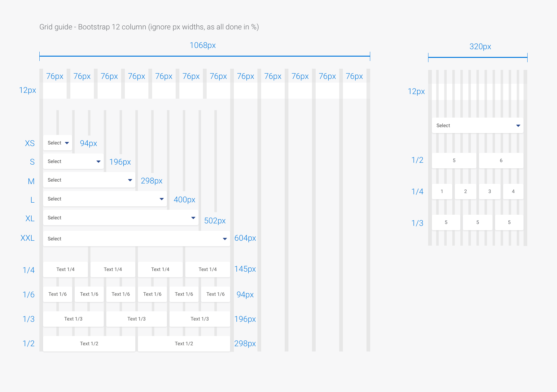
I started by applying best practice to all form elements. Using a clear and precise design system that would work across all screen sizes.
We also looked at the grid system and chose Bootstrap as the frame work.