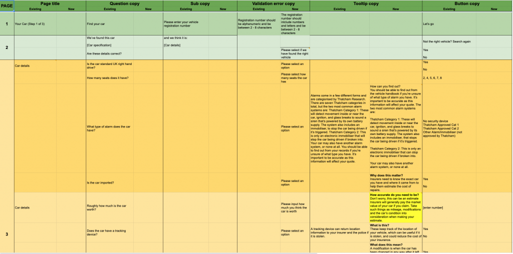
The first time Experian has had to produce such a large multi-step form with over 80 questions.
Our approach was to launch something that not only could compete with the market leaders but actually be better, in terms of the user experience, the user interface and the tone of voice, at the same time providing our customers with the best possible product to suit their needs.
I was brought into Experian to lead on all aspects of UX and UI for their new Car Insurance product, this was a fantastic opportunity for me to get my teeth stuck into launching a new product from scratch.
Responsible for the look and feel of this 80+ question form was a great challenge and one that I felt I could bring a lot of experience to, having previously worked on forms at Simply Business and Tesco.
I helped define Experian’s new, stable, multi-functional, responsive questionnaire which was rolled out to other verticals following the great feedback and success of the insurance form.
We had the advantage of analysing the current market and looking at length at some of our major competitors which we labelled “The Big 4”.
- Compare the market
- Money Super Market
- Confused.com
- Go Compare
This turned out to be a great exercise in determining which companies were doing things really well, what things we should avoid and most importantly, how we can improve the consumer journey so we could really compete with them in the future.
We also had the advantage of having really helpful input from one of our future providers and we had the opportunity to take them through the entire journey and question set and they shared with us some great tips and insight, which helped us shape the journey better and understand from an insurers perspective the data being provided.
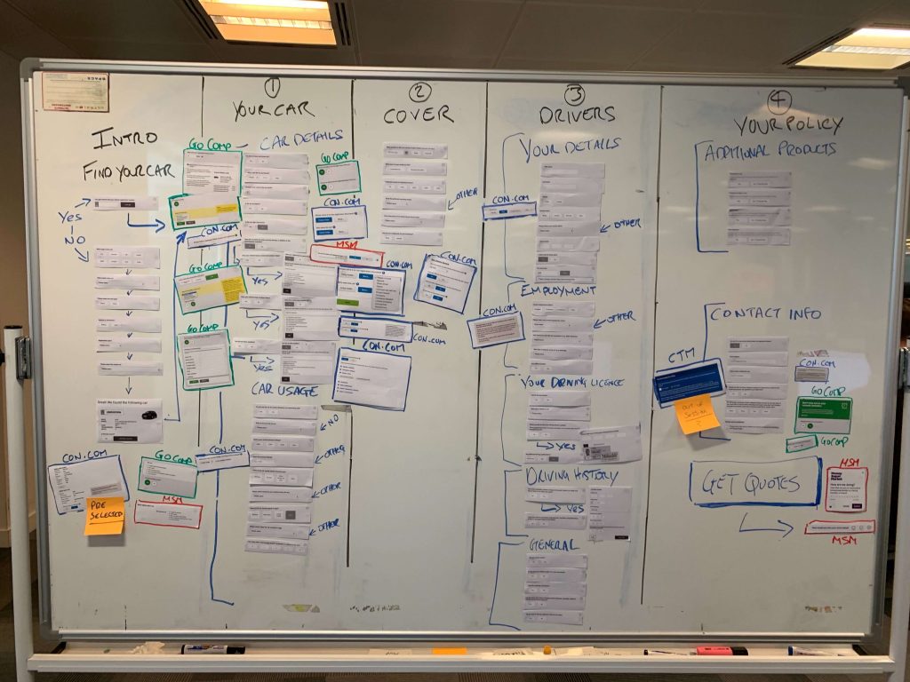
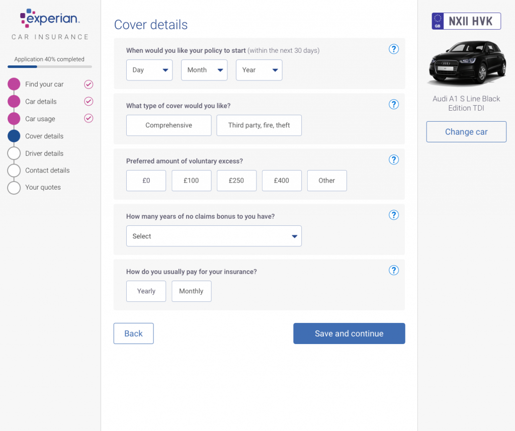
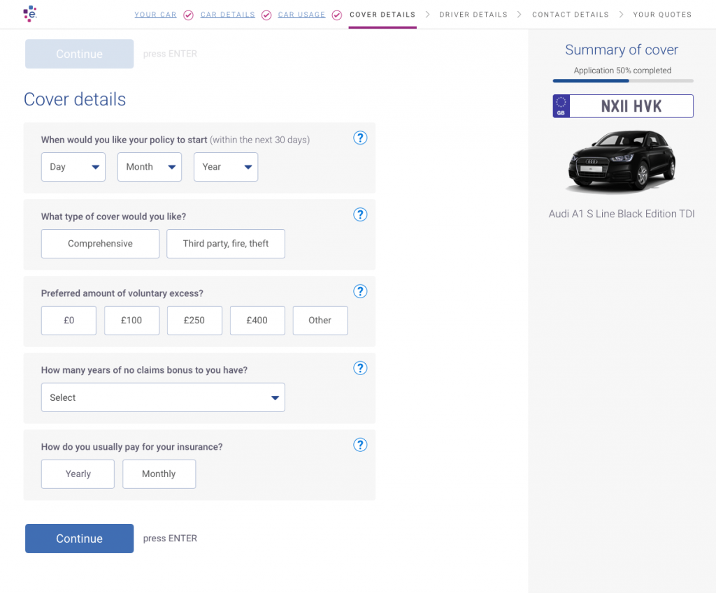
Very early on in the design phase we realised we couldn’t just have a really long form, so obviously this needed to be broken up into sections that made sense to the customer whilst still giving a natural flow.
Progressive disclosure tested really well using What Users Do with real people.
Progressive disclosure is an interaction design technique to help maintain the focus of a user’s attention by reducing clutter and confusion. This improves usability by presenting only the minimum info for the task at hand.
Users felt that the form was really easy to follow and really liked the way it interacted, they also thought the form felt pretty short in comparison to other insurance comparison sites as they weren’t bombarded with lots of questions on one page, as this often feels really daunting and time consuming.
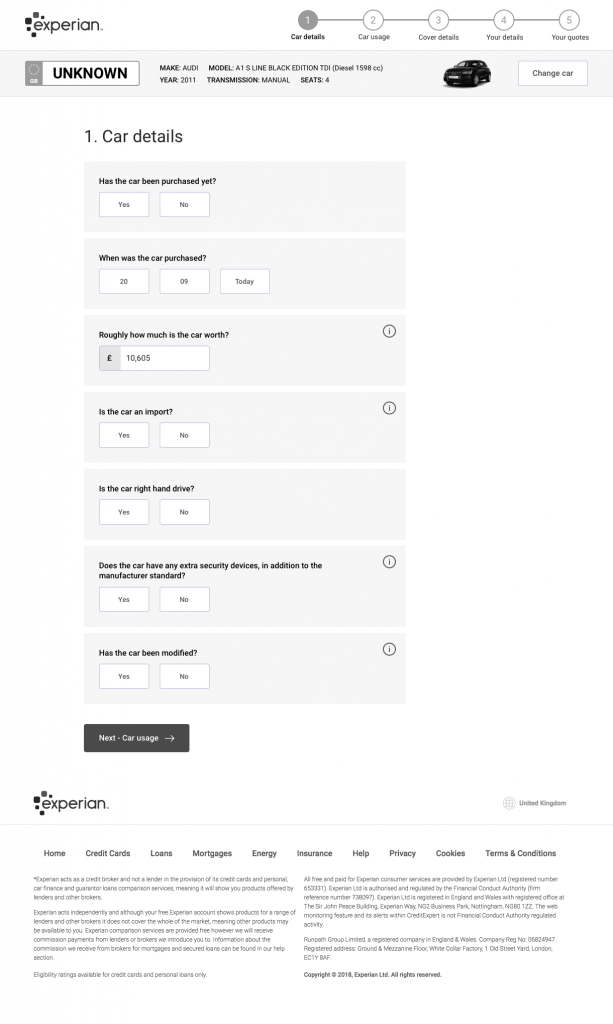
I started the design process with mapping out the full question set and working out the best flow possible which made the most sense to the customer. With nearly 80 questions this was a fair size task, many questions branched off into further questions, so it was essential I had every question to be able to do this accurately.
After the mapping was done, I started laying out some lo-fi wireframes of a potential journey. Which then turned into a fully working prototype which we used to test with real users the length it took to complete.
This was also a really good time and opportunity to look at Experian’s overall current form designs, and make some well needed necessary improvements and try to get some consistency in the design approach for all forms across Experian Consumer Services.
Having worked on forms for a number of years now for various clients, I started by applying industry standard best practices to all form elements, such as input field, dropdown selectors, and radio buttons.
Ultimately my goal was to provide the best customer experience for our customers when filling out and completing forms no matter what device they were using.
I wanted the mobile experience to be really slick as this amounted to around 70% of all traffic. Based on experience I started with writing a list of everything I wanted to include within the design and things I wanted to move away from.
- Large, easily accessible radio buttons
- Reduce the amount of dropdowns used throughout the journey, only using if absolutely necessary.
- Contextual validation based on customers previous answers, filtering out options to prevent errors.
- Helpful tooltips throughout
- Not being afraid of whitespace
- Clean, consistent design of all elements combining aspects of Googles material design, and apples flat design.
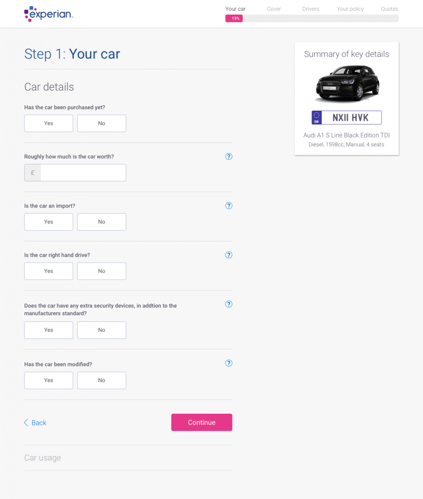
The form itself took on many changes throughout the design process and many iterations were made until we reached the final concept.
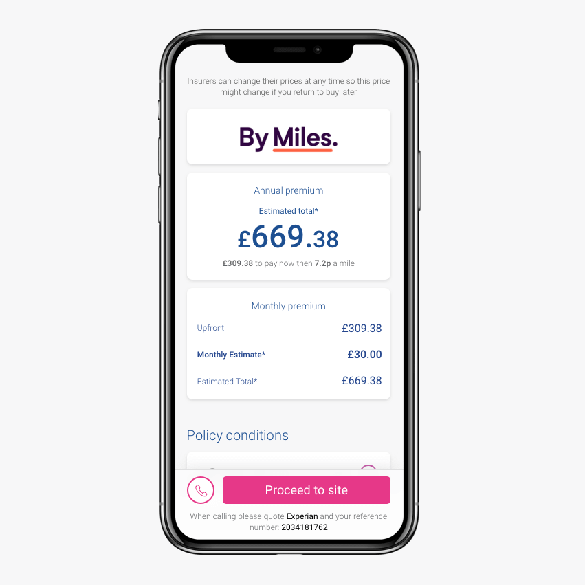
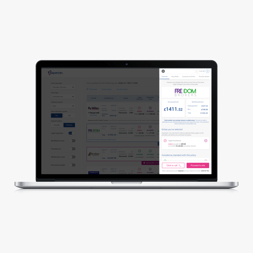
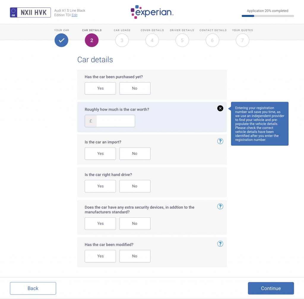
You may have seen from some of the early concepts above the inclusion of an image of the vehicle and also the car manufacturer’s logo. All things we would have loved to do, however complications with image rights meant we had to drop this idea. At the time it did really make our form stand out from competitors but quickly realised it’s probably the same reason no one else has them.
Other iterations such as a softer design approach were applied, removing solid borders from all aspects and replacing with a soft drop shadow. This instantly made the form feel even more modern and was tested really well with users feeling it made the experience feel app based and very native to the device.
Communication is key to any successful product team, and supporting one another through the entire journey.
The major thing I felt I contributed to within this project was the collaboration with testers and front end engineers, which meant a huge reduction in the feedback loop.
Instead of waiting until engineers pushed code all the way through i.e. code reviews, environments, testers etc etc… I paired locally with the team and provided rapid feedback. Preventing so much rework further on.
I was even able to run the environment locally on my machine allowing me to pull down code and test immediately.
I believe the key to any good product is continuous improvement. We initially decided to do an MVP launch, holding back on some of the really cool features that would make us stand apart from the rest to enable us to release a fully working product that we can get real users to get real quotes.
As we ramped up our audience for this form we discovered along the way via Google Analytics and watching real user journeys via SessionCam a few small tweaks that would allow customers to complete the form even quicker.
Nothing too major but just by changing the order of a couple of questions and part-filling a customers driving licence so they only need to enter the last few numbers/letters. It made a big impact in terms of completion rate and form-to-results success.
We have some major feature releases coming up too that we believe will really be big game changers within the car comparison space, ultimately allowing customers to make the best choices when selecting and buying there car insurance, whilst at the same time educating people to understand some of the most common mistakes when purchasing car insurance and hopefully avoiding those frustrating and rather annoying calls to claims centres only to be told you didn’t have the correct cover in place.
Working in a ‘Start-up’ like environment was in my opinion the one thing that really made this team tick. The newly formed “Insurance Dream Team” made up of engineers, testers, product owners and of course myself, delivered a beautiful, fully integrated web application with over 40+ leading insurers and over 60+ brands.
We’ve had fantastic feedback to date from users just getting a quote to customers who have gone onto buy a policy. Many of which have mentioned how quick, easy and simple the form is to complete and how they were easily able to compare different quotes and select the right cover and policy for their individual needs.
I was also able to show off my coding skills and my all round desire to get stuck into anything during my 18 months at Experian, by picking up the odd simple (1 pointer) story and helping the PO create, manage, refine and prioritise these.
Testing and quality assurance was also an important principle in the team so I was often hands-on testing with developers/testers during the implementation of my designs. This included multiple browsers, being able to run application code locally and fixing small UI bugs myself.
I loved every minute of this role and wish Experian every success with this super product.
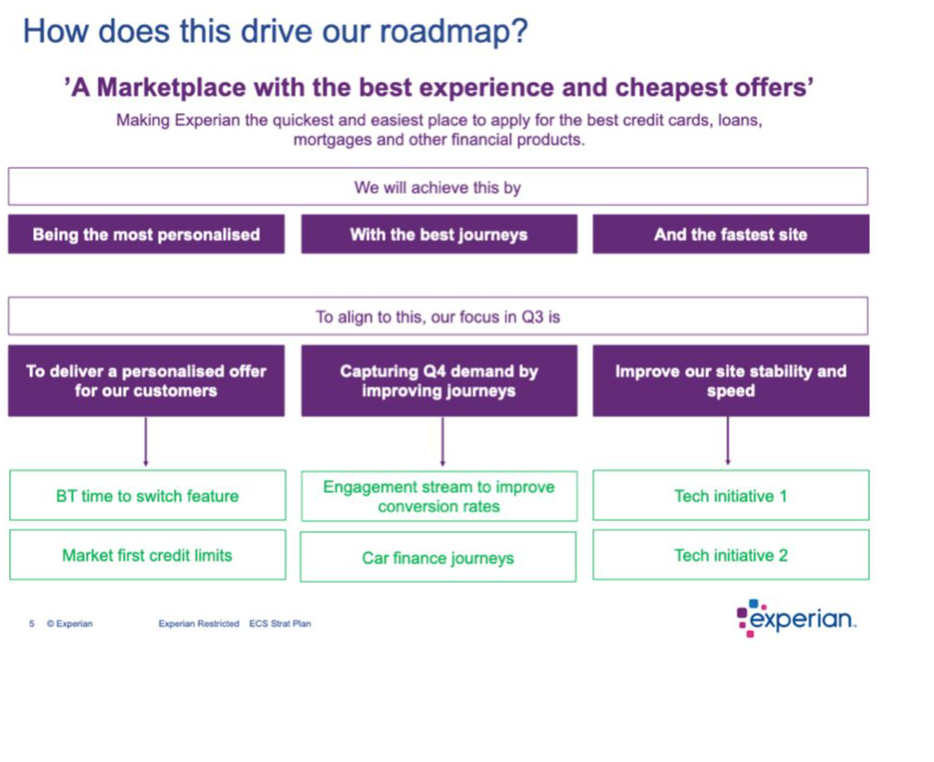
I was fortunate enough during my time at Experian to work closely with the MD, looking at the future of Experian’s ‘Marketplace’ and potentially what v2 could look like, coming up with early sketches and visual concepts.
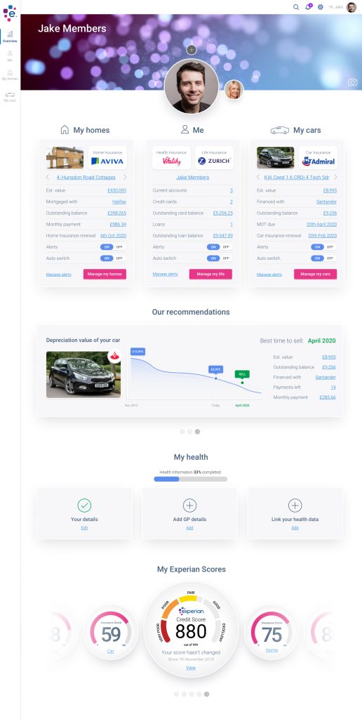
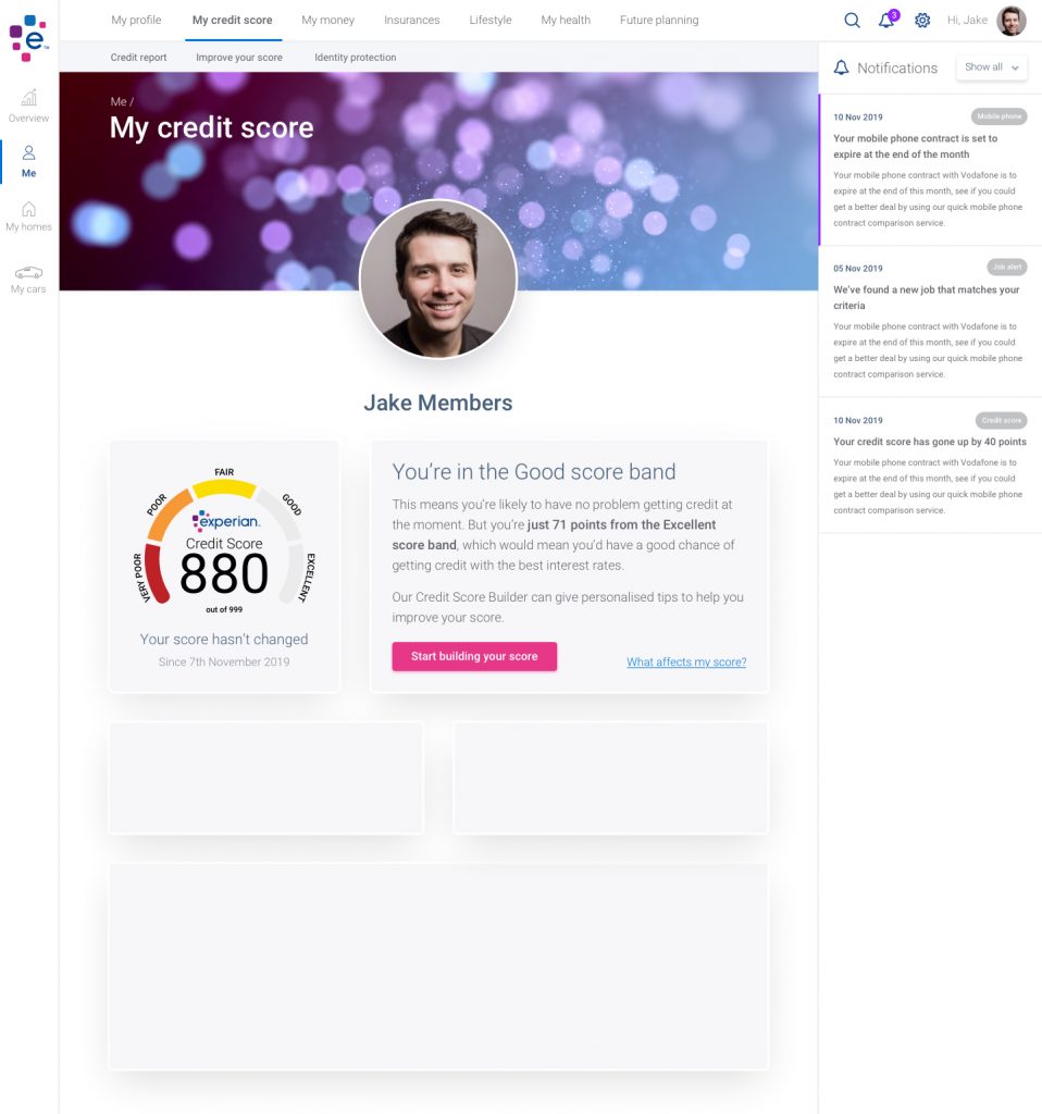
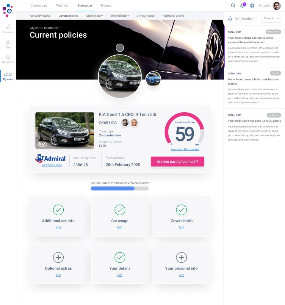
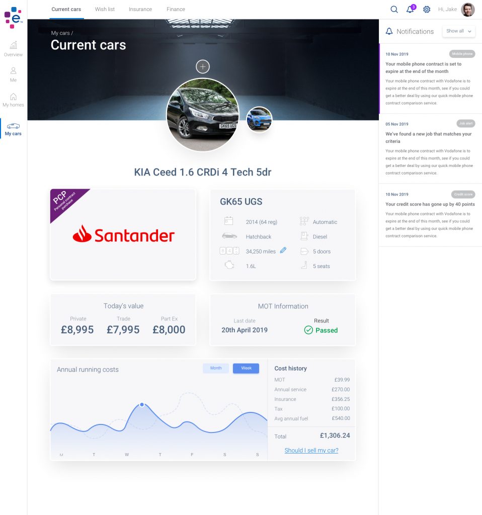
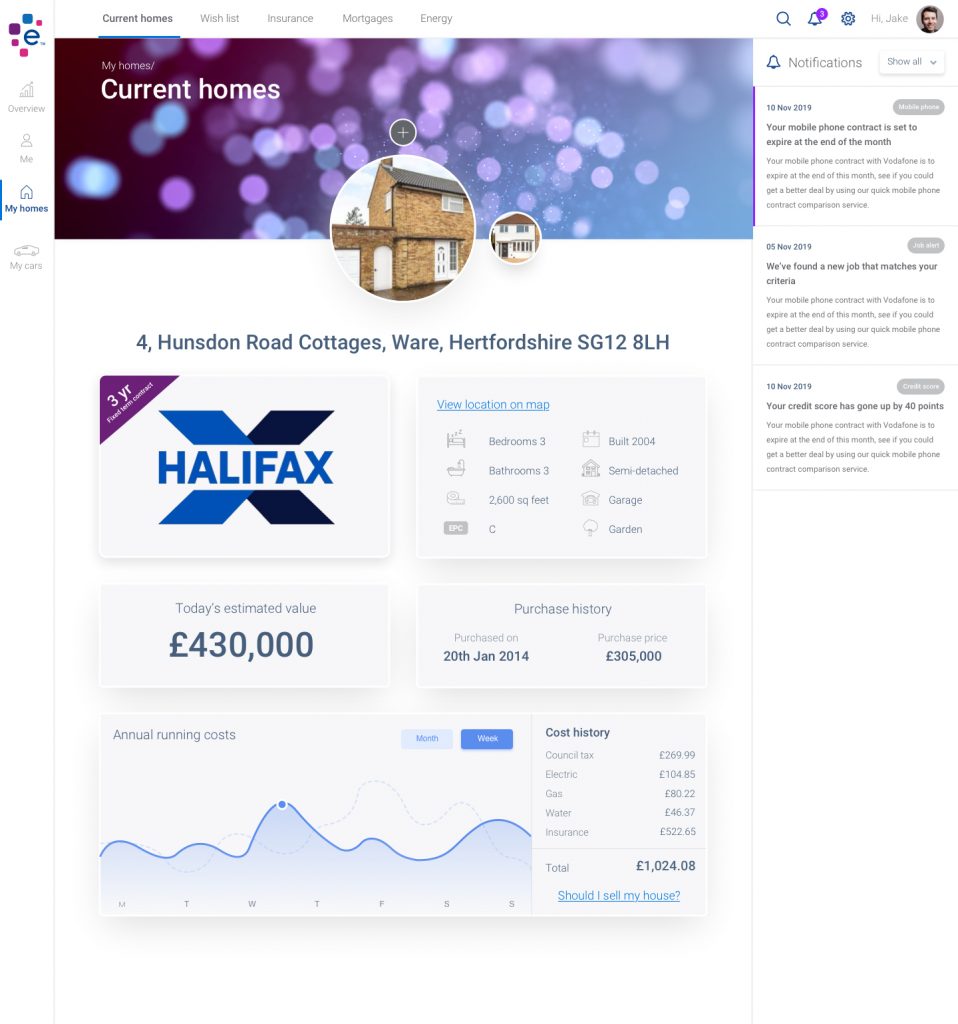
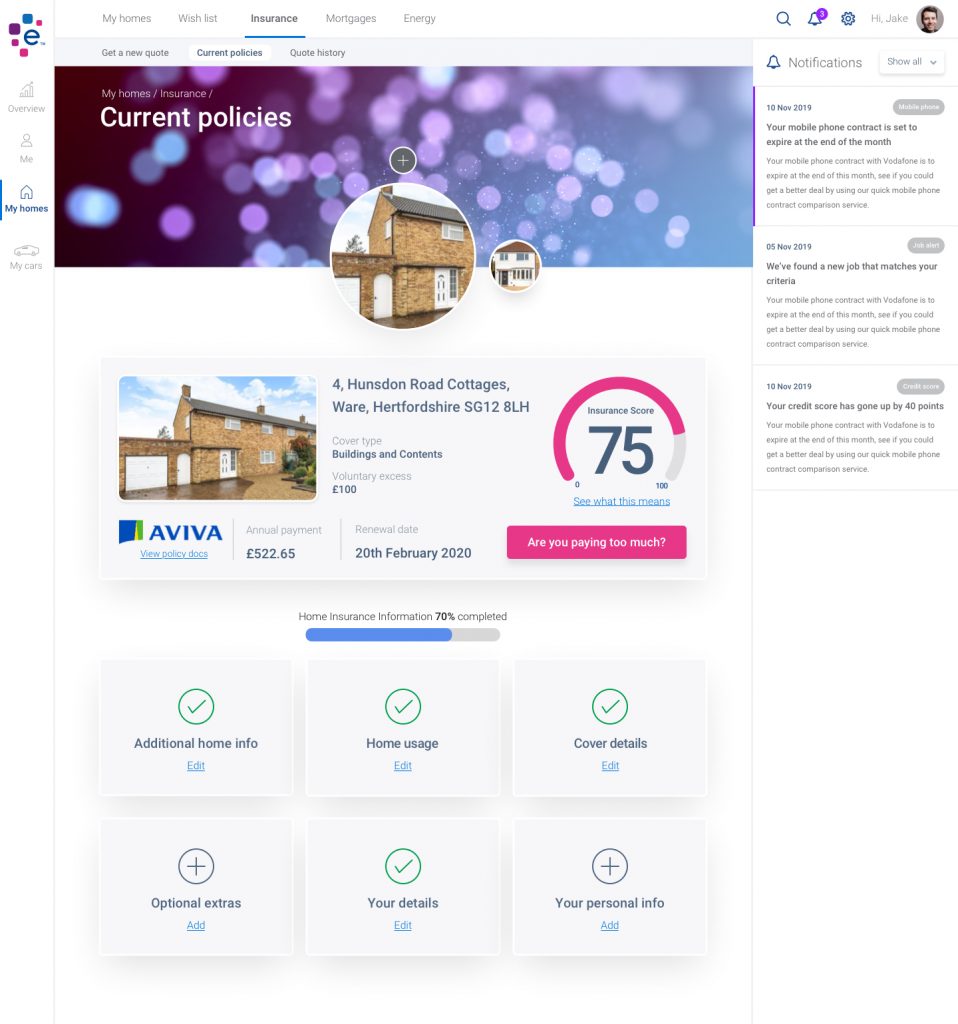
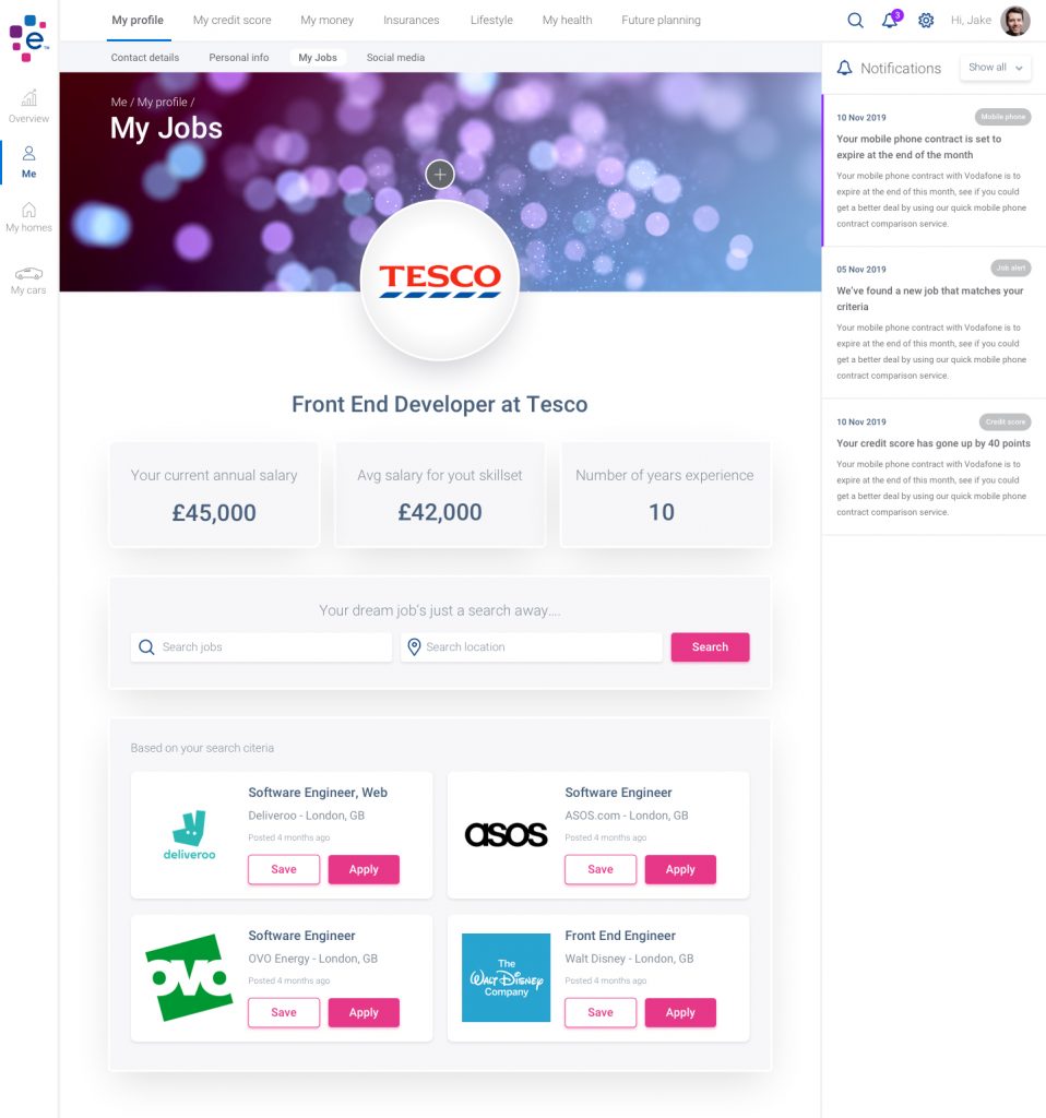
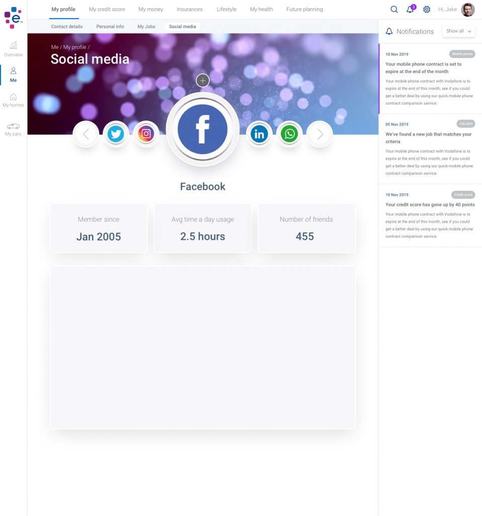
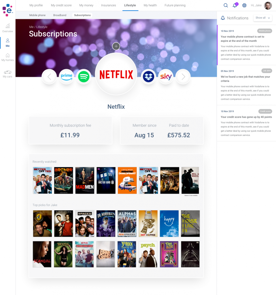
The idea would be to have a fully enhanced web application that told a customer everything about there life where they could manage not only there financial commitments, but also a one stop shop capturing your full profile on you; including information on your health, your homes, your vehicles and your finances, plus lots more.


