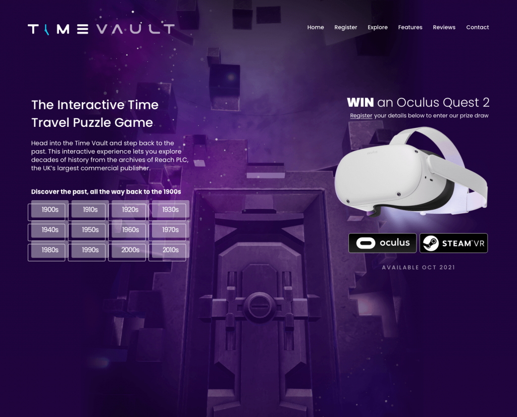
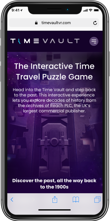
I joined ReachLabs in January 2021 and another product I was immediately asked to look at was at the time an unnamed virtual reality game, known today as TimeVault.
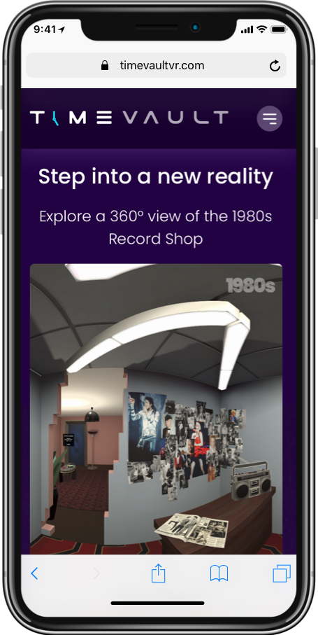
Although the game itself was being designed and built by a third party. I was asked to look at the branding and identity for this product. From the logo to the website, in-game artwork, digital marketing materials and many other digital assets that would help bring TimeVault to life.
Once the name had been chosen I started creating some early concepts for the logo based on the nature and concept of the game.
The TimeVault game once finished would be available on the Oculus platform and after obtaining a VR set of my own, I got to work on testing the game from a user perspective, giving constructive feedback as and when new releases were available to test.
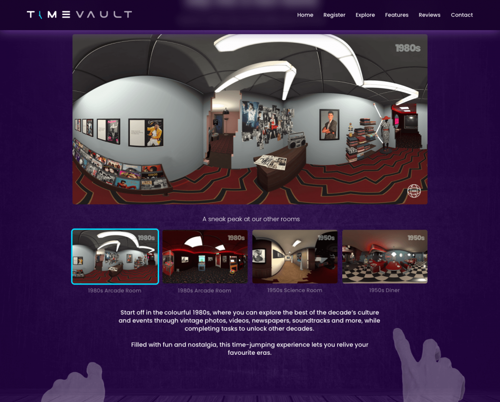
As TimeVault was an interactive time-travel puzzle game and the premise was to travel back in time to certain decades by unlocking and going through a vault door; I wanted to explore some concepts around walking through portals, time travel and vaults.
Some early concepts are below:
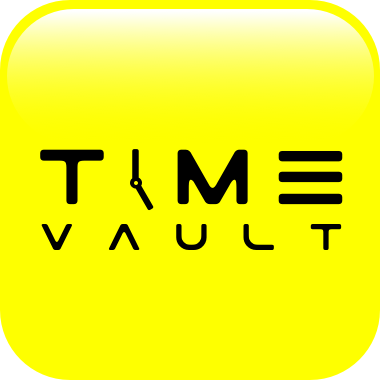
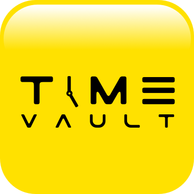
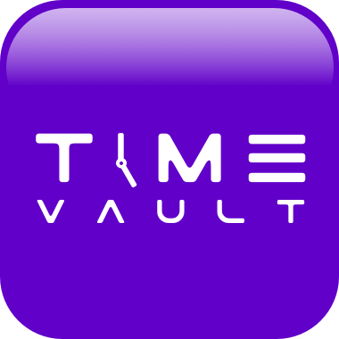
Logo
I settled on a more simplistic logo as I didn’t want to make overly busy as the visuals for the game itself were going to be really strong so felt in this (as is the majority of the time) less is more.
So I landed on just selecting a futuristic font style which could also be tied in with time-travel by changing the ‘I’ in the word ‘Time’ to the hands of a clock which represented the time element.
A simple change but one I think was really effective.
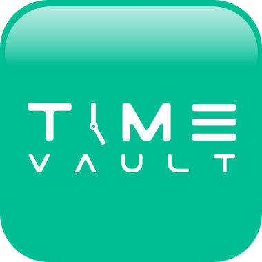
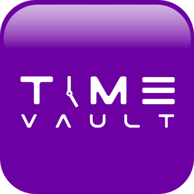
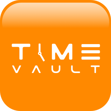
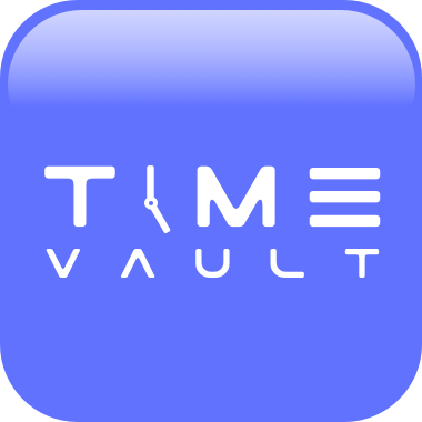
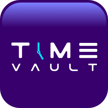
Colours
In terms of the colour pallet chosen, I played around with some different colour choices, originally looking at a real strong bright yellow, but just felt this lacked depth and was way to vibrant, toning this down and going for a warmer mustard yellow still didn’t feel right, so moved the body colours to more of a rich indigo and in contrast to that having a Cyan / Aqua blue as the accent colour, these colours worked really well from visual perspective.
I finished the pallet with lighter and darker purples to help emphasize certain elements within the design.
This is the first phase of the time-travelling adventure game which will hopefully expand in the months ahead. I believe with some tweaks to the in-game functionality, movement/control gestures and applying some of the core branding the TimeVault game can be a huge success,